1. Describing data
Nine people work at a small company. Here is what they earn, in thousands:
38,\quad 42,\quad 45,\quad 45,\quad 48,\quad 52,\quad 55,\quad 60,\quad 415
So what does a typical person here earn? The average says 89. Not one of the nine earns anything close to that — eight of them earn less than 61, and the ninth earns 415. The gap between the arithmetic answer and the honest one is what this lesson is about.
Everything here is descriptive. We are summarising numbers we already have. No uncertainty, no prediction, no probability — that starts in the next lesson.
Where is the centre?
There are three standard answers, and on real data they genuinely disagree.
The mean
Add the numbers up, divide by how many there are:
\bar x = \frac{1}{n}\sum_{i=1}^{n} x_i = \frac{800}{9} = 88.\overline{8}
The median
Sort the values and take the middle one. With n = 9 there are four below and four above, and 48 sits in the middle. With an even count you average the middle two.
The key property: the founder's 415 counts as exactly one number above the middle, no matter how enormous it is. Change it to 415,000 and the median does not move at all.
The mode
The most common value — here 45, which occurs twice. It is the only one of the three that works on data that isn't numeric at all: the most common blood type, the most frequent word in a document.
Three measures of centre, one dataset:
| Measure | Value | Moved by the outlier? |
|---|---|---|
| Mean | 88.9 | Yes, enormously |
| Median | 48 | No |
| Mode | 45 | No |
A statistic that barely moves when you distort a small part of the data is called robust. The median and mode are robust; the mean is not.
How spread out is it?
Centre is only half the story. Two classes can have identical mean exam marks and look nothing alike — one clustered tightly around the mean, the other split between very high and very low. You need a second number.
Range
Largest minus smallest: 415 - 38 = 377. Simple, and almost useless here — it is determined entirely by one person.
Interquartile range
Sort the data, find the value a quarter of the way in (Q_1) and the value three quarters of the way in (Q_3), and subtract. The middle 50% of the data lives in that gap.
Split the sorted values at the median and take the median of each half:
Q_1 = \operatorname{med}(38, 42, 45, 45) = 43.5 \qquad Q_3 = \operatorname{med}(52, 55, 60, 415) = 57.5
\mathrm{IQR} = 57.5 - 43.5 = 14
Fourteen, against a range of 377. The IQR ignores the founder entirely, which is exactly what makes it useful.
A warning that will save you an hour. There is no single agreed definition of a quartile. The rule above (median of each half) is Tukey's, and it is what most textbooks teach. NumPy's
np.percentiledefaults to a different, interpolated rule and reports Q_1 = 45, Q_3 = 55, IQR = 10 for this same data. Neither is wrong; they are different conventions. When your code disagrees with a textbook by a little, this is usually why.
Variance and standard deviation
The standard measure. Take each value's distance from the mean, square it, average the squares — that average is the variance — then take the square root to get back into the original units:
\sigma^2 = \frac{1}{n}\sum_{i=1}^{n}(x_i - \bar x)^2 \qquad \sigma = \sqrt{\sigma^2}
Read \sigma as roughly the typical distance from the mean. For our salaries \sigma = 115.5 — larger than eight of the nine actual salaries, which tells you how badly one extreme value distorts it.
Why square the distances at all? Because the raw distances always sum to exactly zero — the positives and negatives cancel by construction. Squaring removes the signs, and it punishes far-away points much harder than near ones.
n or n-1? Dividing by n gives the variance of these nine numbers. Dividing by n-1 estimates the variance of the wider population they came from. Python's
statisticsmodule spells the differencepvariancevsvariance. We'll derive where n-1 comes from in §4 — for now, just know the two exist and don't mix them up.
Shape: which measure to trust
Draw a histogram — bars counting how many values fall into each band — and the shape tells you which measure of centre to believe.
When the distribution is symmetric, the mean, median and mode land on top of one another and the choice doesn't matter. When it is skewed they separate, and always in the same order:
\text{right-skewed (long right tail):}\quad \text{mode} < \text{median} < \text{mean}
The mode sits at the peak, the mean is dragged furthest towards the long tail, and the median falls in between. Left-skewed data reverses it.
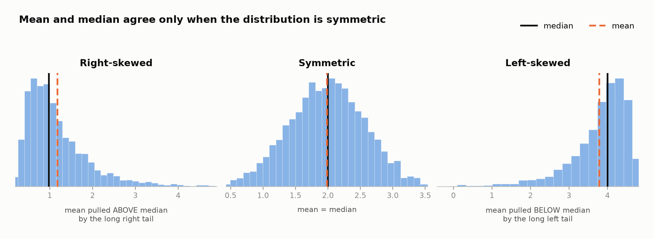
The middle panel is the only one where it makes no difference which number you quote. In the other two, the gap between the solid and dashed lines is the skew — and it is the gap that gets exploited when someone reports whichever of the two flatters their case.
Our salaries are textbook right-skew: 45 < 48 < 88.9. The mean has been hauled out into the tail, away from every actual person.
So whenever someone quotes an average income, or an average house price, this is the picture to have in mind — and the median is usually the more honest number.
Worked example
Five houses on a street sell for (in lakhs): 42, 48, 51, 55, 304. Report the centre and spread, and say which numbers you'd quote to a buyer.
Mean: (42 + 48 + 51 + 55 + 304)/5 = 500/5 = 100.
Median: sorted, the middle value is 51.
Range: 304 - 42 = 262.
IQR: with n = 5 the median is the 3rd value; the halves are (42, 48) and (55, 304), so Q_1 = 45, Q_3 = 179.5, IQR = 134.5.
The mean of 100 describes no house on the street — four sold for under 56. Quote the median, 51. The distribution is right-skewed, and you can verify it without drawing anything: mean (100) > median (51), which is the signature.
Notice the IQR is large here too. With only five points, one of the two upper values is the outlier, so even the IQR can't hide it. Robustness is a matter of degree, not a guarantee.
Doing it in Python
The statistics module is in the standard library — no install, no import
cost — and covers everything above except the quartiles.
import statistics as st

salaries = [38, 42, 45, 45, 48, 52, 55, 60, 415]

print("mean  ", round(st.mean(salaries), 1))
print("median", st.median(salaries))
print("mode  ", st.mode(salaries))
print("range ", max(salaries) - min(salaries))
print("sd    ", round(st.pstdev(salaries), 1))   # population; st.stdev() is the n-1 version
For quartiles, write Tukey's rule directly — it's three lines and you know exactly which convention you're getting:
import statistics as st

def tukey_iqr(data):
    """Q1, Q3, IQR using Tukey's hinges: the median of each half, with an
    odd-length middle value excluded from both halves."""
    x = sorted(data)
    n = len(x)
    lower, upper = x[: n // 2], x[(n + 1) // 2 :]
    q1, q3 = st.median(lower), st.median(upper)
    return q1, q3, q3 - q1

salaries = [38, 42, 45, 45, 48, 52, 55, 60, 415]
print(tukey_iqr(salaries))          # (43.5, 57.5, 14.0)

# NumPy's default is a different convention — compare, don't panic:
import numpy as np
print(np.percentile(salaries, [25, 75]))   # [45. 55.]  -> IQR 10
Your turn
1. Seven daily commute times, in minutes: 22, 25, 25, 27, 31, 34, 96. Find the mean and the median. Which one would you tell a friend, and why?
2. A dataset has mean 50 and median 72. Without seeing the data, what shape is it, and where is the long tail?
3. Add the value 50 to the dataset 10, 20, 30, 40, 50. Does the mean go up, down, or stay the same? What about the median?
Solutions
1. Sum = 22+25+25+27+31+34+96 = 260, so the mean is 260/7 = 37.1 minutes. The median is the 4th of seven sorted values: 27.
Tell your friend 27. Six of the seven commutes are 34 minutes or less; the mean of 37 is above all but one of the actual days. The 96-minute day was presumably an accident or a breakdown, and it alone drags the mean up by roughly 9 minutes.
2. Mean < median means the tail is on the left — the distribution is left-skewed (negatively skewed). The ordering reverses the right-skew case: mean (50) < median (72) < mode. A small number of unusually low values are pulling the mean down. Exam marks where most students do well but a few fail badly look like this.
3. Original: mean = 150/5 = 30, median = 30. After adding 50: values are 10, 20, 30, 40, 50, 50, so mean = 200/6 = 33.3 — up, because 50 is above the old mean. The median becomes the average of the middle two of six values, (30 + 40)/2 = 35 — also up.
The general rule: adding a value above the current mean pulls the mean up; adding one above the current median can move the median up by at most one "step" to the next data value, however large the new value is.
Check yourself in code
Compute the three measures of centre for the commute data from question 1, and print which one is larger. Print exactly three lines, in this format:
mean 37.14
median 27
right-skewed
Round the mean to 2 decimal places. Print right-skewed if the mean exceeds
the median, left-skewed if the median exceeds the mean, and symmetric if
they're equal.
import statistics as st

commutes = [22, 25, 25, 27, 31, 34, 96]

mean = st.mean(commutes)
median = st.median(commutes)

print("mean", round(mean, 2))
# print the median line, then decide the shape and print it
import statistics as st

commutes = [22, 25, 25, 27, 31, 34, 96]

mean = st.mean(commutes)
median = st.median(commutes)

print("mean", round(mean, 2))
print("median", median)

if mean > median:
    print("right-skewed")
elif median > mean:
    print("left-skewed")
else:
    print("symmetric")
Mean, median and mode for the centre. Range, IQR and standard deviation for the spread. A histogram for the shape, which tells you which of them to believe.
All of it describes numbers you already have. But the moment you ask whether these nine salaries tell you anything about anyone else, you need a way to talk about uncertainty — and that raises a question worth answering carefully. Next: what is probability?